HouseCare
Overview
Houses require a lot of upkeep and fixing. Sometimes it gets overwhelming the number of tasks and reminders that have to be done every month so it is easy to forget about them. However, people often deal with tight schedules between work and life so procrastination and delays become the principal factor to their house maintenance problems.
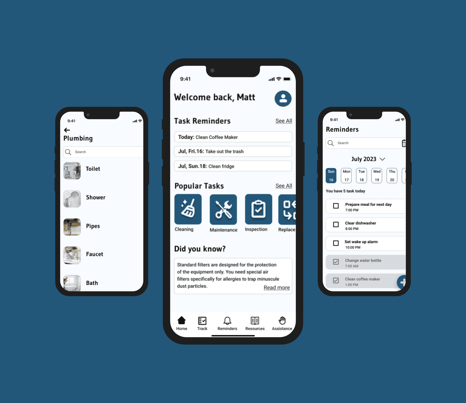
The purpose of HouseCare is to provide a better organization for the user through reminders and tracks. It also offers a variety of resources, so the user can search for specific products or tools information, as well as articles and blogs to get other people’s opinions.
Problem
Managing multiple house tasks and repairs can be overwhelming, especially for a new homeowner or a forgetful person. The lack of house maintenance could cause damage to the property, decrease the house value, and bring health issues for homeowners and pets.
Solution
HouseCare allows people to be more organized with their house maintenance, offering different options to track items, search products, and set reminders.
Role
- Sole UX/UI Designer and Researcher Timeline
- 16 weeks
Process
- Discovery
- Ideation
- Design
- Testing
Tools
- Figma
- Miro
- Zoom
Discovery
Secondary Research
Through my secondary research, I found common factors that often affect homeowners’ emotions and their house care.
- Not all homeowners are prepared for the amount of tasks and/or repairs that a house could require.
- Having too many tasks can lead to fatigue or procrastination, making it challenging to decide what to do first.
- Some tasks need to be done by professionals but some people prefer to look on the Internet to try to fix them. This can cause damage to the house if they are not done correctly.
Primary Research
After finishing the secondary research, there were so many factors found that could affect house maintenance and so many consequences as well that it was necessary to look for interviewees to learn more about their thoughts, routines, and how they deal with their house maintenance.
Survey
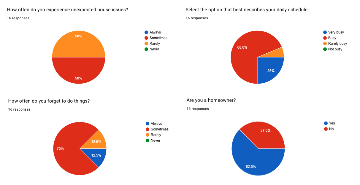
Thanks to my research, I was able to define the participants’ characteristics and create a quick survey. The participants were recruited through social media and a close circle of acquaintances. There were a total of 16 participants, 20% men and 30% women, all of them in their 30 years old. As homeowners, all the participants have problems with remembering things and have faced house maintenance struggles.
Interviews
I selected 5 participants and conducted remote interviews via Zoom, which helped me gather valuable information and to understand the participants’ struggles with their house maintenance.
There were discussed specific subjects, such as users’ daily schedules and routines, house maintenance knowledge, and remembering to do things.
Affinity Mapping
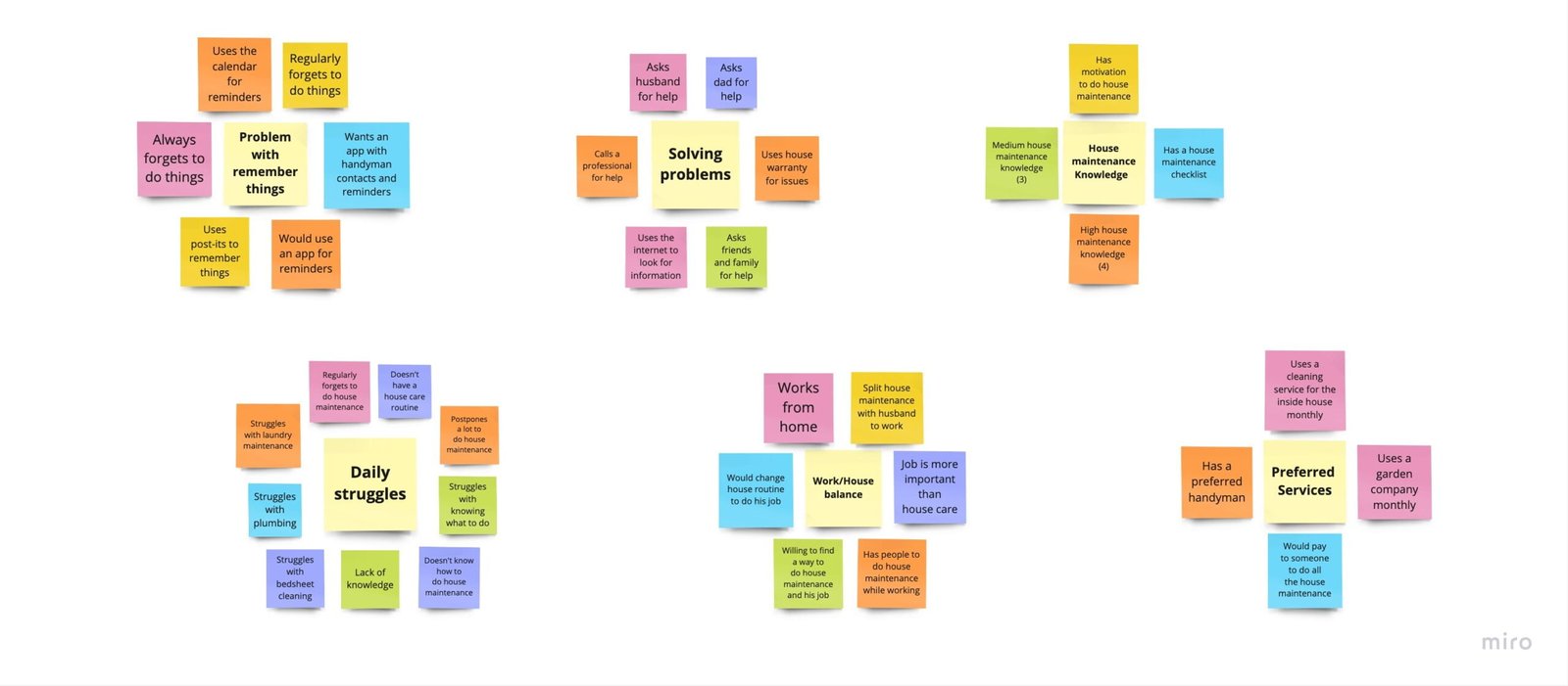
After analyzing all the data from the interviews, I created 6 categories: problems with remembering things, daily struggles, work/house balance, solving problems, preferred services, and house maintenance knowledge.
These specific categories helped me to understand better the user and focus on solving those common factors that affect their day to day with their house maintenance.
Empathy Mapping
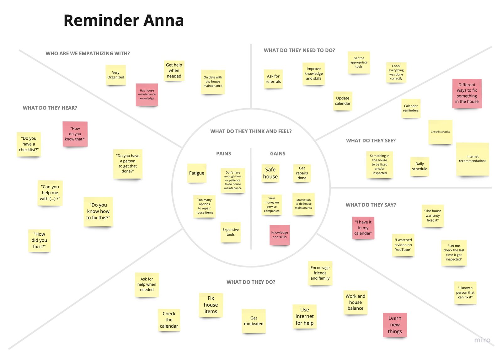
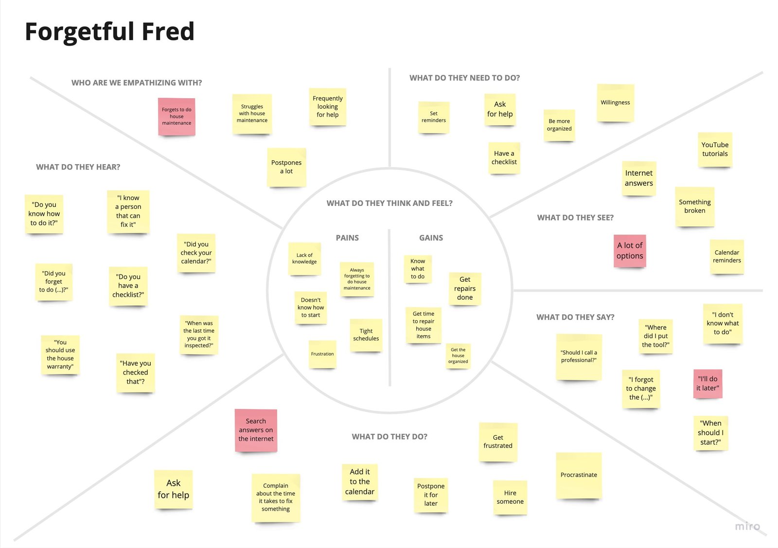
There were created 2 empathy maps, which represent the 2 personalities of the users: Forgetful Fred and Reminder Anna. These personalities helped me go deeper into the user’s head and look for future solutions to the case study problem.
Personas
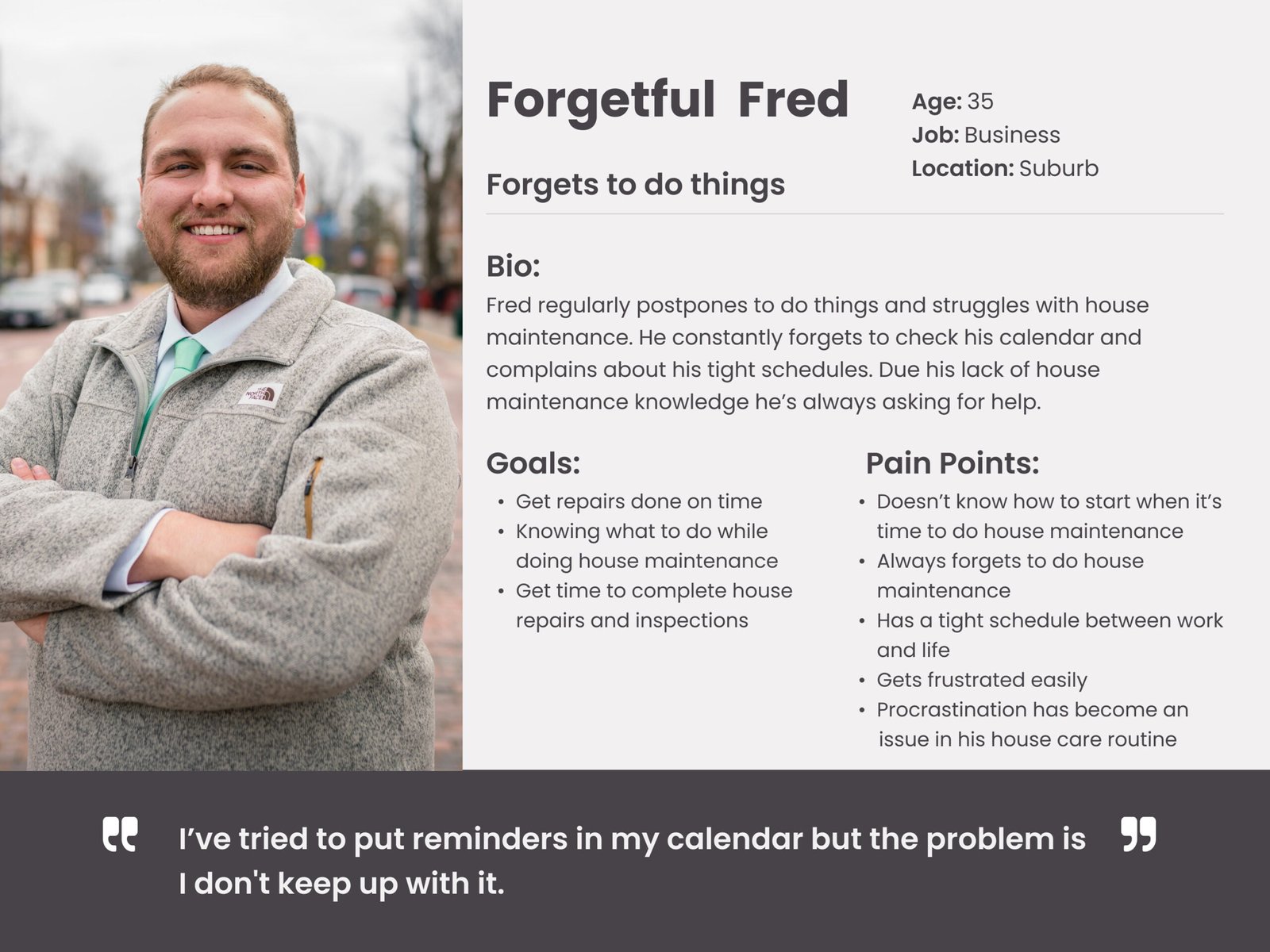
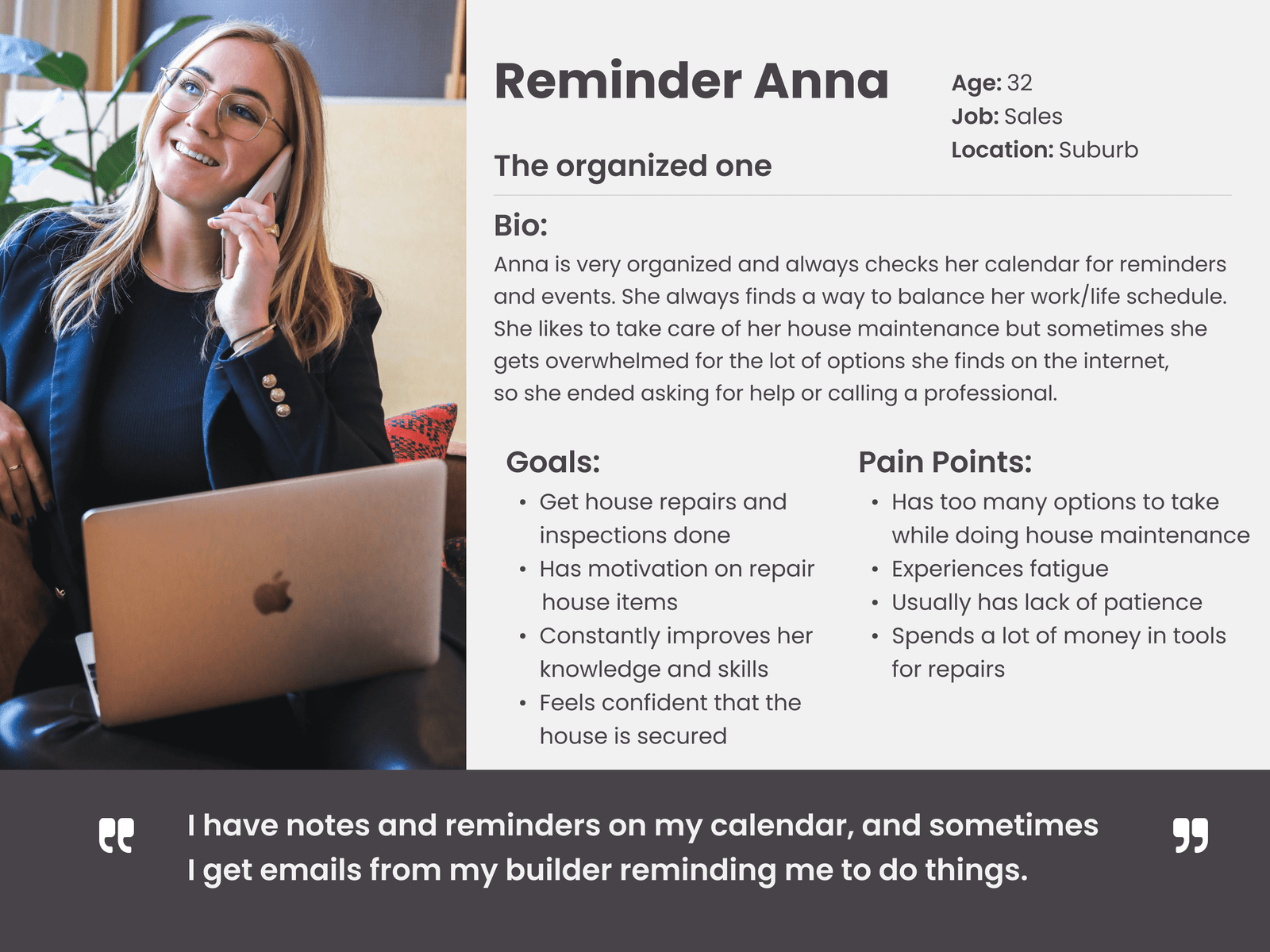
The 2 personas were based on the information gathered in the empathy maps. These characters helped me to visualize and empathize more with the users and allowed me to be more predictable while designing the app.
Ideation
How Might We
The following How Might We statements were created to consider what would the users think about doing house maintenance and how the app would help to solve those problems. This helped me to generate some ideas for future sketches.
- How might we help users to keep track of their house maintenance?
- How might we relieve users’ overwhelming feelings while doing house maintenance?
- How might we make it easier for users to start doing house maintenance by themselves?
- How might we help users to select the right option to repair a house item?
Ideation
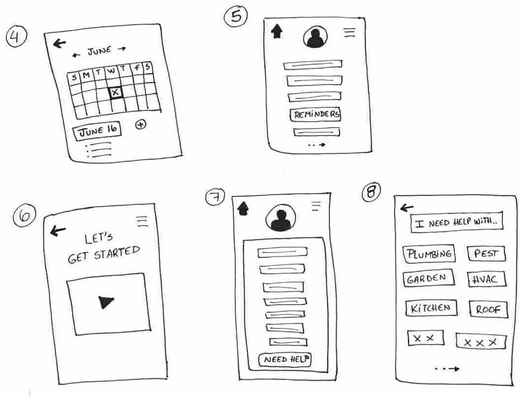
The How Might We statements helped to put the ideas together and create some sketches trying to solve the problems.
User Stories
The following User Stories allowed me to prioritize the user’s needs and organize the future screens and flows in the app.
As a user…
- I want to keep track of my house maintenance so that I can know what needs to be done.
- I want a list of tools and products, so I can know which one to buy.
- I want to set reminders so that I can be more organized.
- I want access to blogs and forums, so I can get people’s opinions and recommendations.
- I want to check if a house item has been maintained, so I can be sure about it.
Sitemap
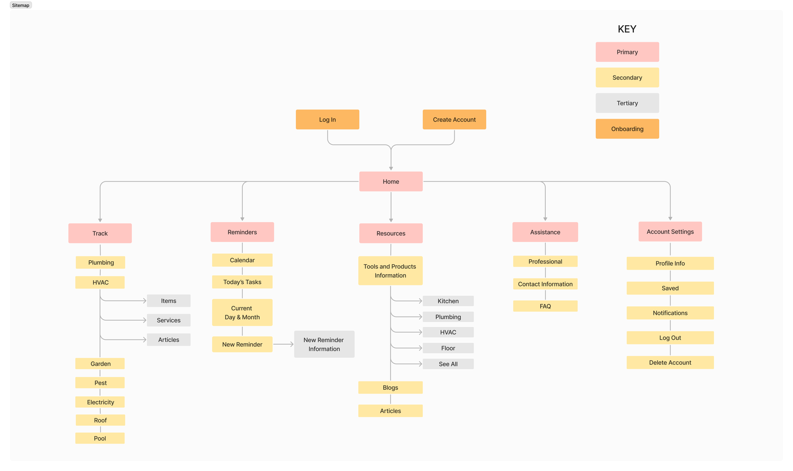
Creating the sitemap helped me to organize and break the features for each screen and split up different categories for future flows.
I included the basic house maintenance categories so the users could have an extended list of options.
User Flows
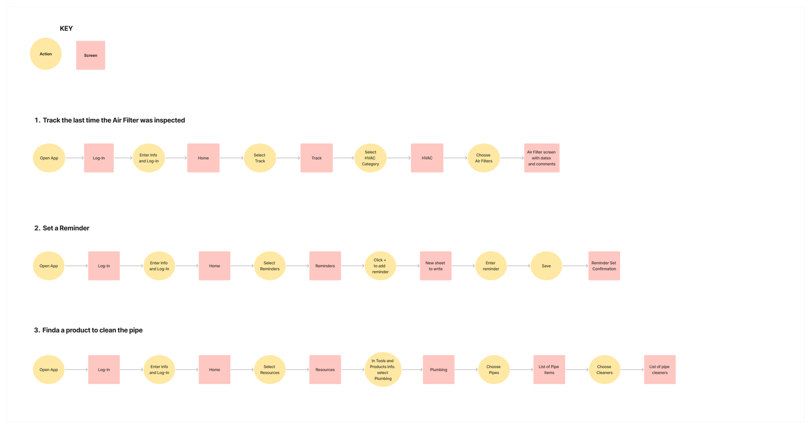
I created 3 different routes so I could visualize and understand better every step the users need to go through the app to complete the goal. These 3 routes were selected upon other tasks because these would be the most common chores that a user could do in the app.
- Track the last time the Air Filter was inspected
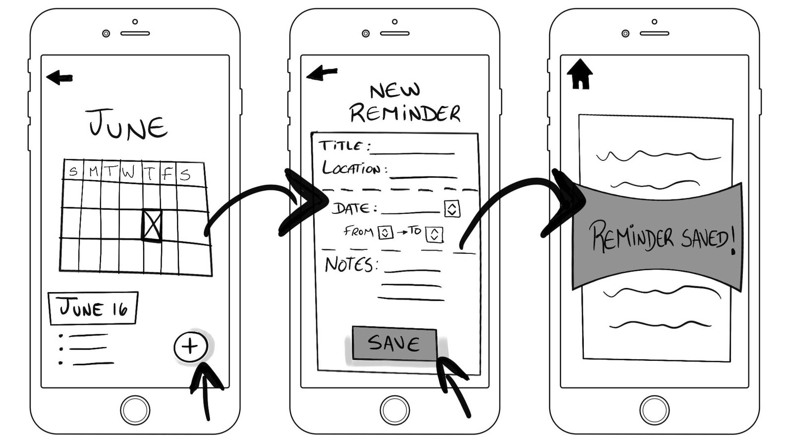
- Set a reminder
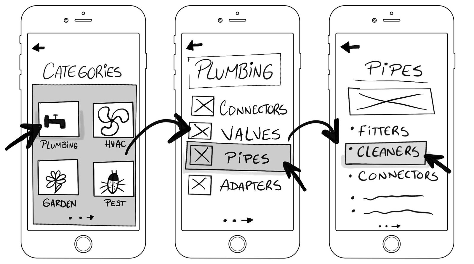
- Find a product to clean the pipe
Sketches
Focusing on the 3 user flows created, I made a few sketches to reflect the screens and details options for the app. The sketches allowed me to finally design the app structure and get a better visualization
Design
Wireframe
Figma was an excellent tool to create the wireframes and it was an important process because it was the start of giving life to the app and the opportunity to try out the ideas I sketched before.
Mood Board
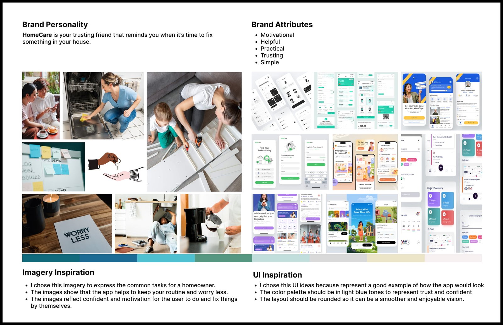
The brand platform helped me to determine and communicate the app’s purpose, along with its personality and attributes.
After several searches, I put together some samples of colors, pictures, and UIs styles to finally get a better shape of the mood board.
The pictures show daily activities for a homeowner and reflect a carefree environment by using the app. The light blue colors represent confidence, which is part of the brand attributes.
Styleguide
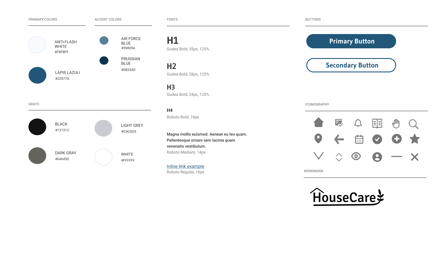
Developing a style guide allowed me to organize all the ideas gathered in the mood board and put them together to ensure that everything matches and has an enjoyable perception.
Some of the principal attributes of the app are: to be simple and trustful, so the blue tones provide that feeling.
High Fidelity Screens
Thanks to the mood board and style guide, I was able to put everything together and get a better look for the app and simplify the navigation experience for the users. Choosing the correct iconography and imagery was an important process to get good visual quality and hierarchy to the content displayed.
Prototype
The prototype was created using Figma and it allowed me to visualize the final look of the app and evaluate step by step the 3 user flows I created before. Every wireframe was smooth and clear for the users to navigate through.
Testing
Usability Testing
The objective of the usability testing was to identify any possible issue that might hinder users from using the app so it can be improved in the future.
There were selected 5 participants who fit the characteristics of the case study for the usability testing in order to gather feedback and observe their reactions to the app. The interviews were conducted remotely via Zoom and recorded for future notes.
The participants were asked to complete the following tasks:
- Track the last time the Air Filter was inspected
- Set a reminder
- Find a product to clean the pipes
After testing the app, the participants shared their thoughts and feelings which helped to identify small issues that needed to be improved for the app’s performance.
Issue #1
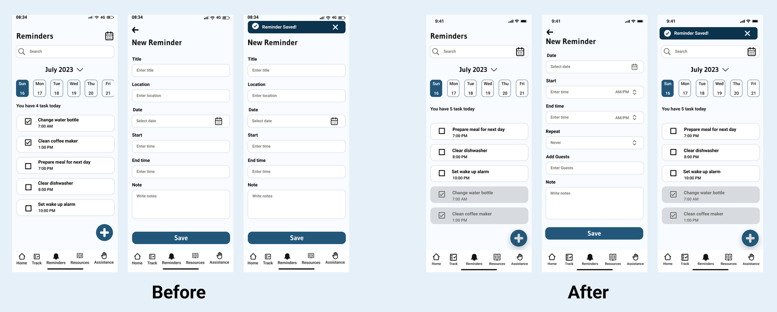
Some users expected to click on “Saved” instead of “X” to get back to the Reminders screen.
Solution
Make the “Saved” button the one to close and exit to the New Reminder screen and include a quick notification indicating that the reminder has been saved.
Issue #2
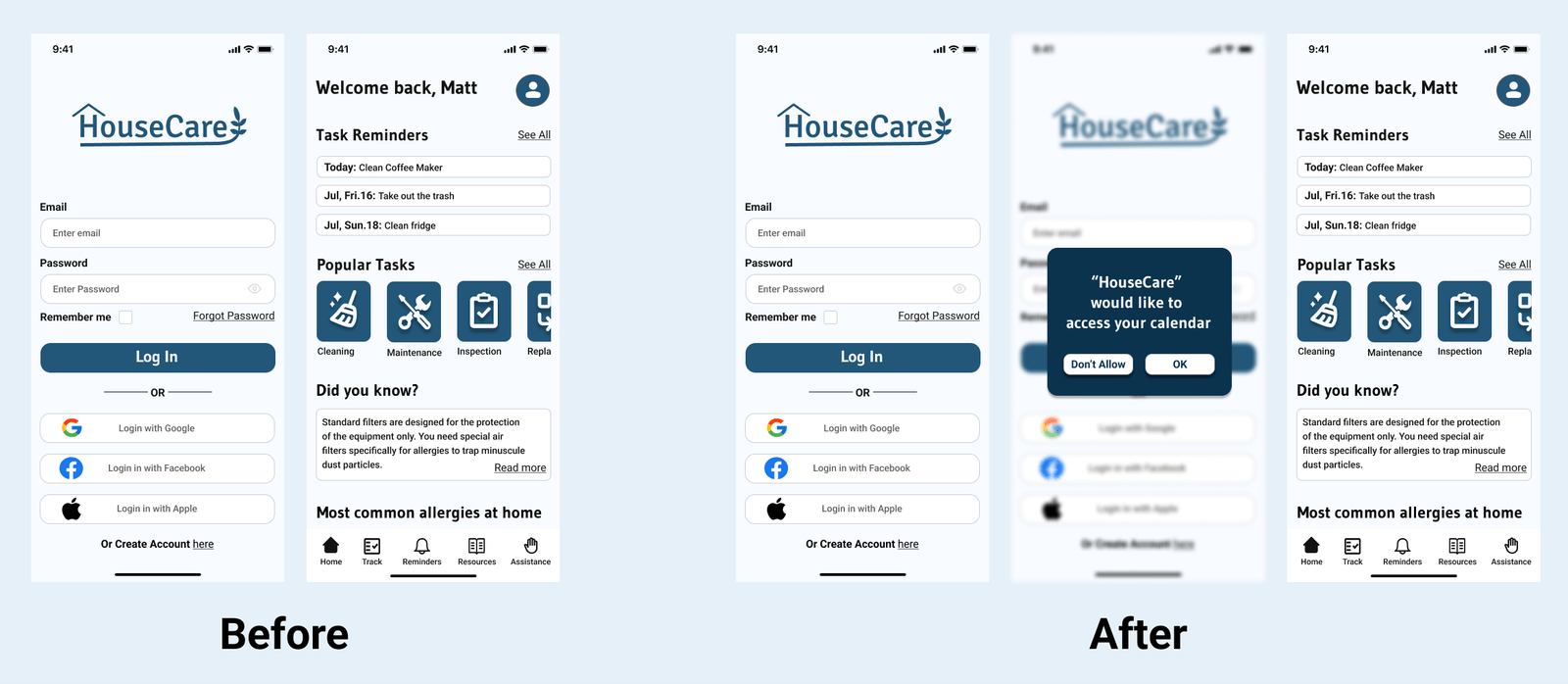
Users wanted to connect the app’s calendar to their smartphone’s calendar.
Solution
Once the users login to the app it will ask permission to connect the app’s calendar to their smartphones.
Issue #3
Users wanted to have the link to the products to look at them on their website.
Solution
Include the product’s link in the description.
Redesign
Following the users’ feedback and comments, I applied the solutions for the 3 principal issues found in the prototype in order to improve the app’s performance and satisfy the users’ need.
Redesign #1
Made the “Saved” button the one to close and exit to the New Reminder screen and include a quick notification indicating that the reminder has been saved.
Redesign #2
Included permission to connect the app’s calendar to the user’s smartphone’s calendar.
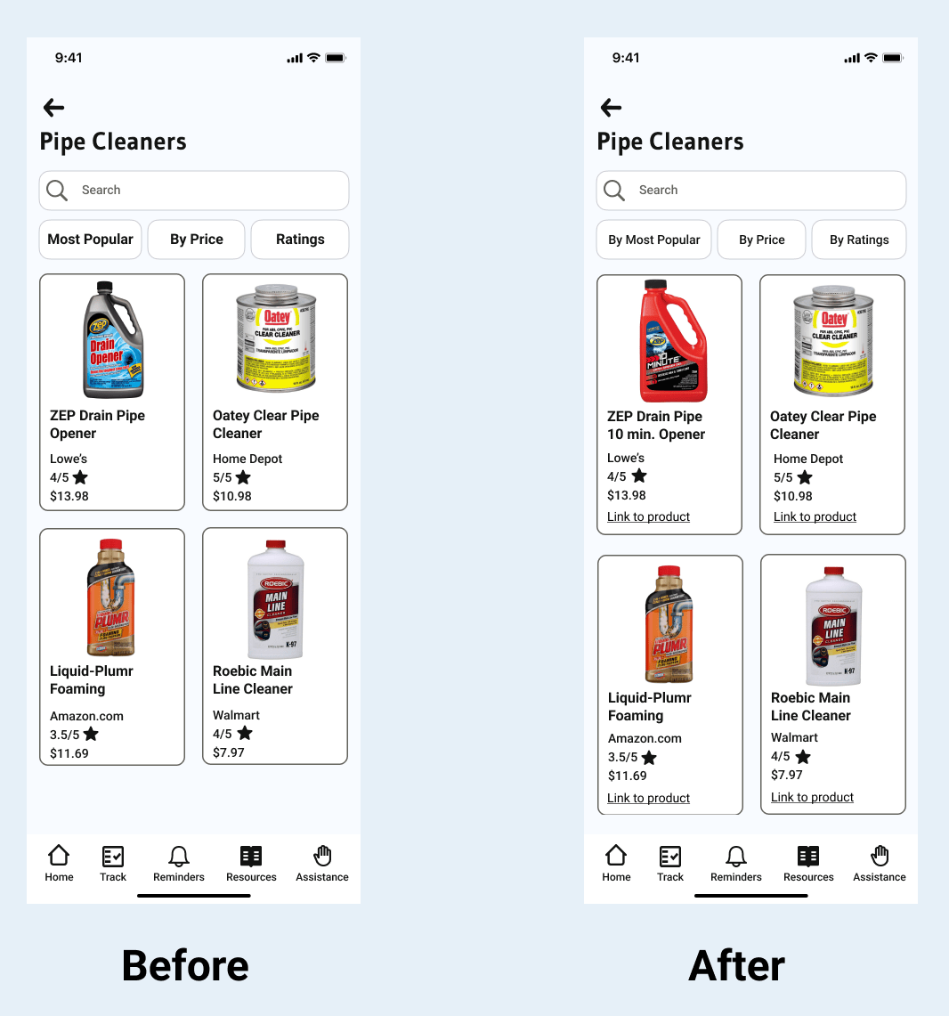
Redesign #3
Include the product’s link in the description.
Reflection
Working on this project helped me to understand, in a better way, how UX/UI works. Every step and detail is crucial to create a good user experience. It’s not only colors and buttons, it’s the user’s psychology and environment too. The process of creating this application made me empathize more with the user’s needs and problems.
This project provided me with valuable new skills and knowledge that will help me in my professional future for sure.
Taking advance of my A.S. in Marketing, I put into practice my “customer psychology and needs” knowledge. I also have a background in art, which helped me more in the UIs part.
The idea of expanding my knowledge and studying web design was always there, so this project helped me a lot to get started.